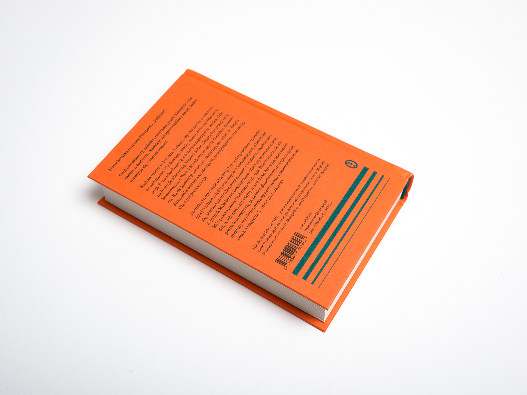
The book is a family saga from pre-war Poland. The author writes about the everyday life of his Jewish ancestors living in a small city and how their world was by the WW2. In any other hand, this story might come out as contrived and artificial. But Łoziński, a talented writer of a young generation, spent several years on research before he started writing his novel. His writing is restrained, not in the least sentimental, and yet profoundly moving and heart-rending.
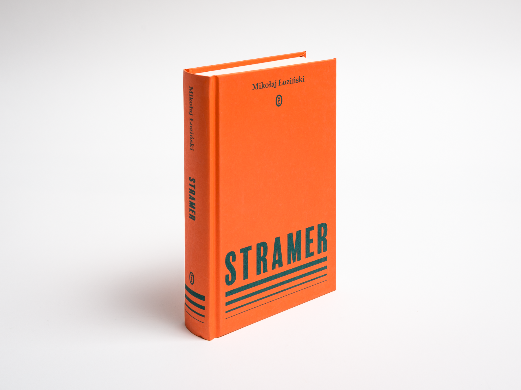
My ambition was to create a cover that would somehow resemble typographic solutions of the Polish designers of the 1930s: crude, but warm. I found the inspiration in the last lines of the novel and the image of a sun setting over a sea – the type layout on the front cover and a set of thinner and thinner lines is a distant echo of the sun's reflections on a calm sea.
Year: 2019
Page size: 123 x 197 mm
Pages: 432
Paper: Munken Print Cream 15 90 g
Paper: Munken Print Cream 15 90 g
Binding: hardcover
Cover material: Geltex 115 g uncoated stock
Typefaces: Balboa, Chronicle Text
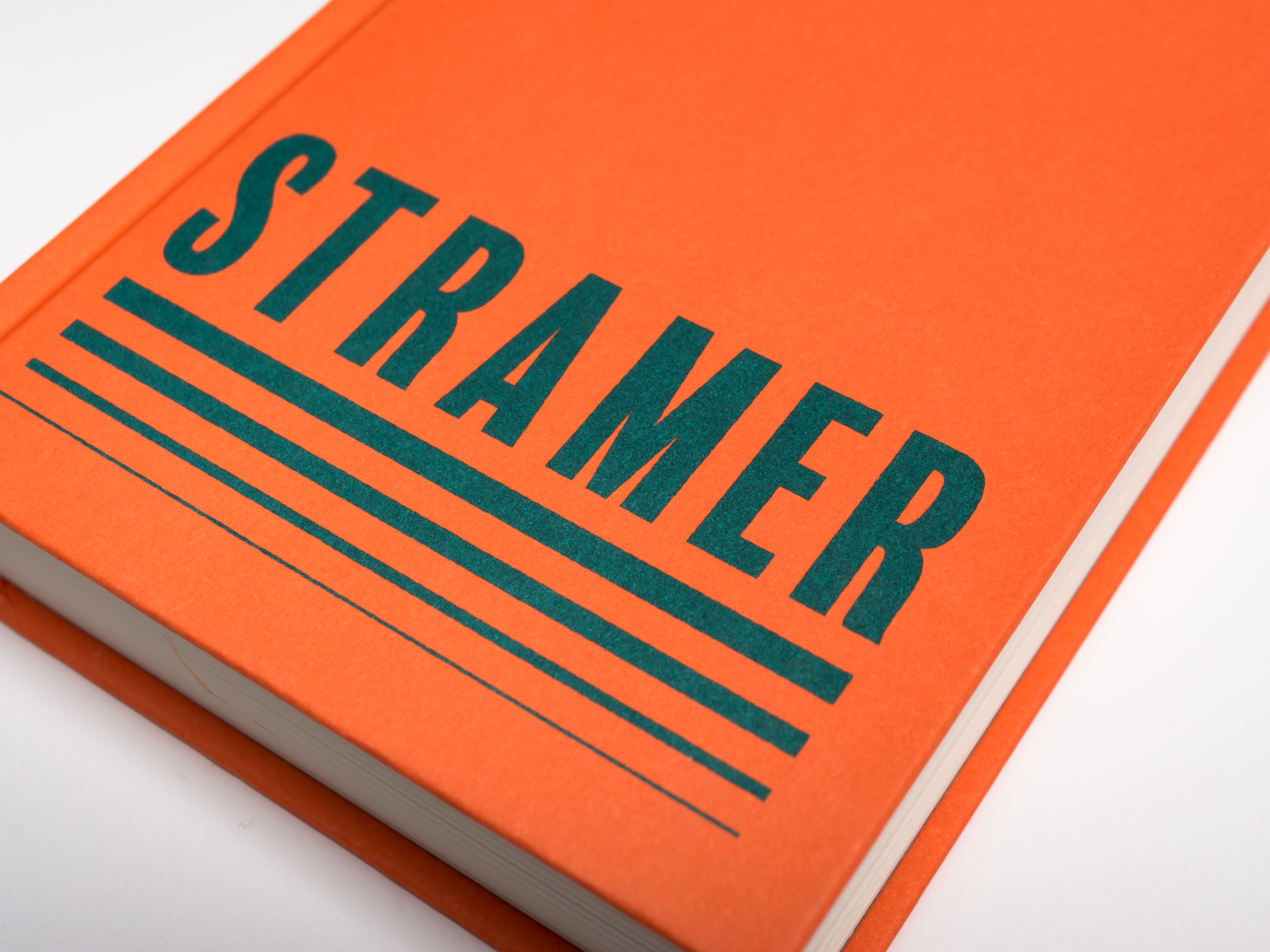
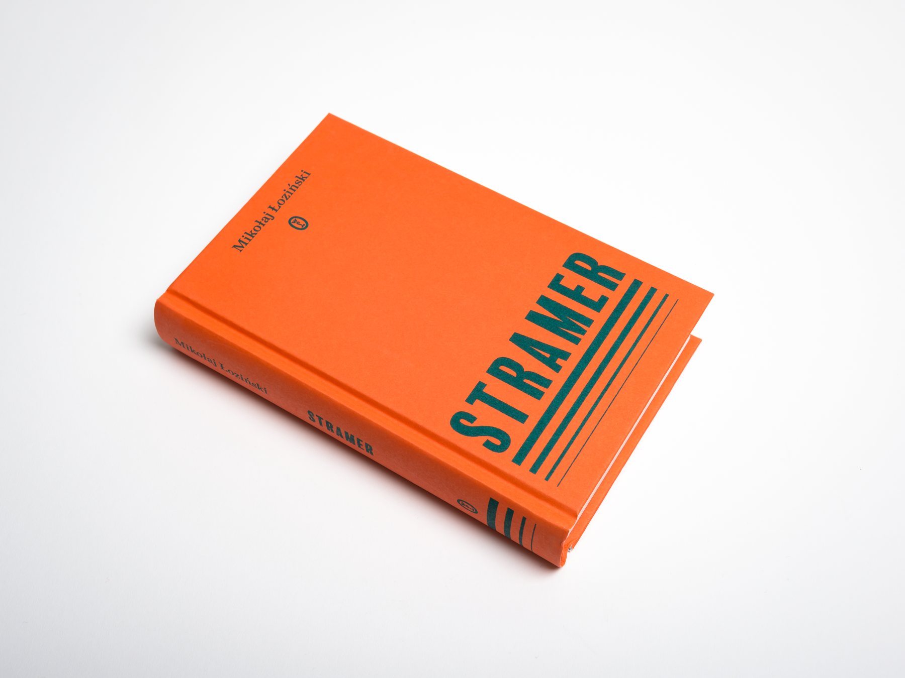
I chose Balboa by the magnificent Jim Parkinson as a title typeface because though it is in no way connected to the Polish vernacular typography of those day, it is at the same time striking and delicate.