How I Stopped Loving Design
Things I Have Not Thrown Out
Things I Have Not Thrown Out
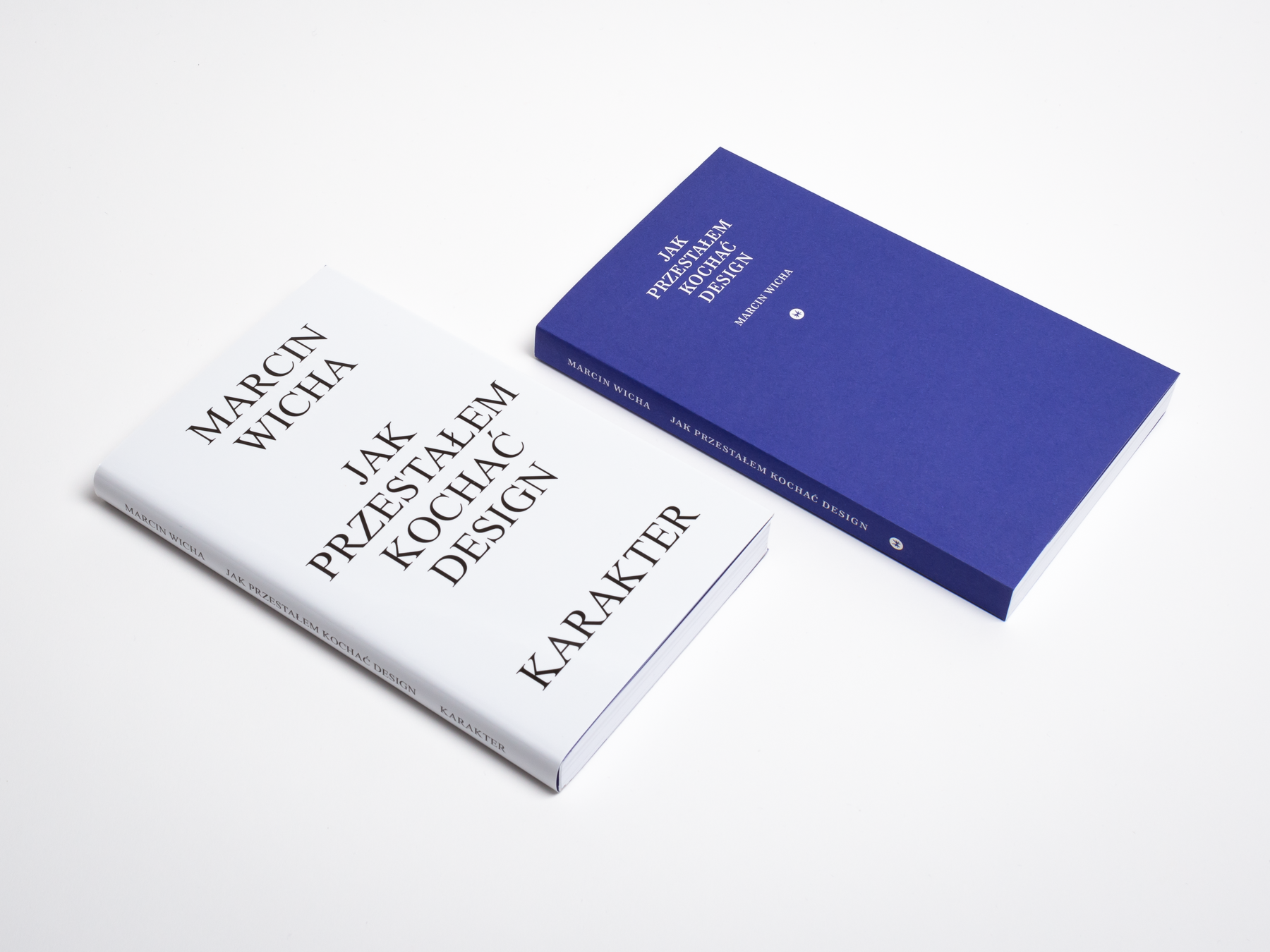
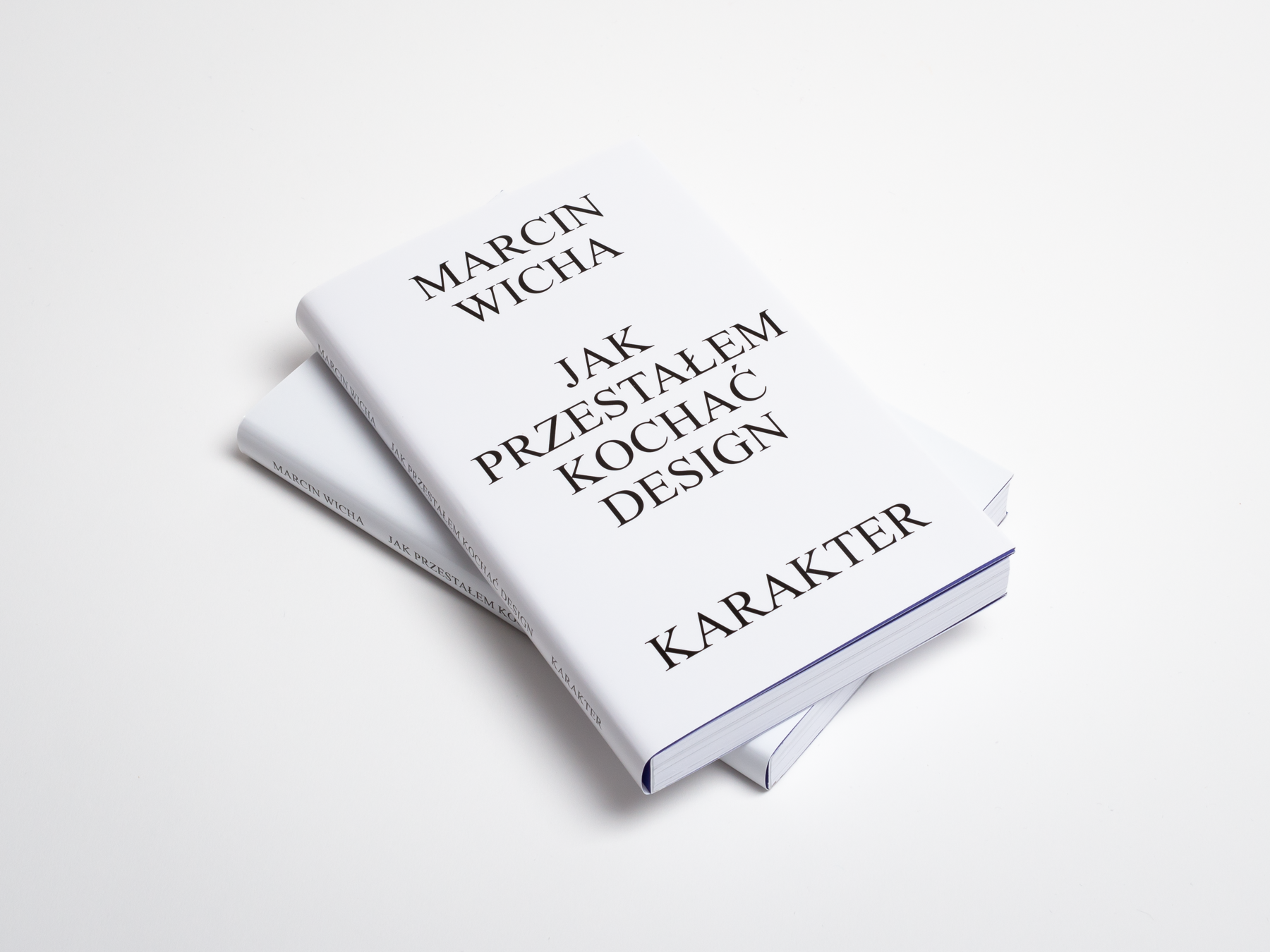
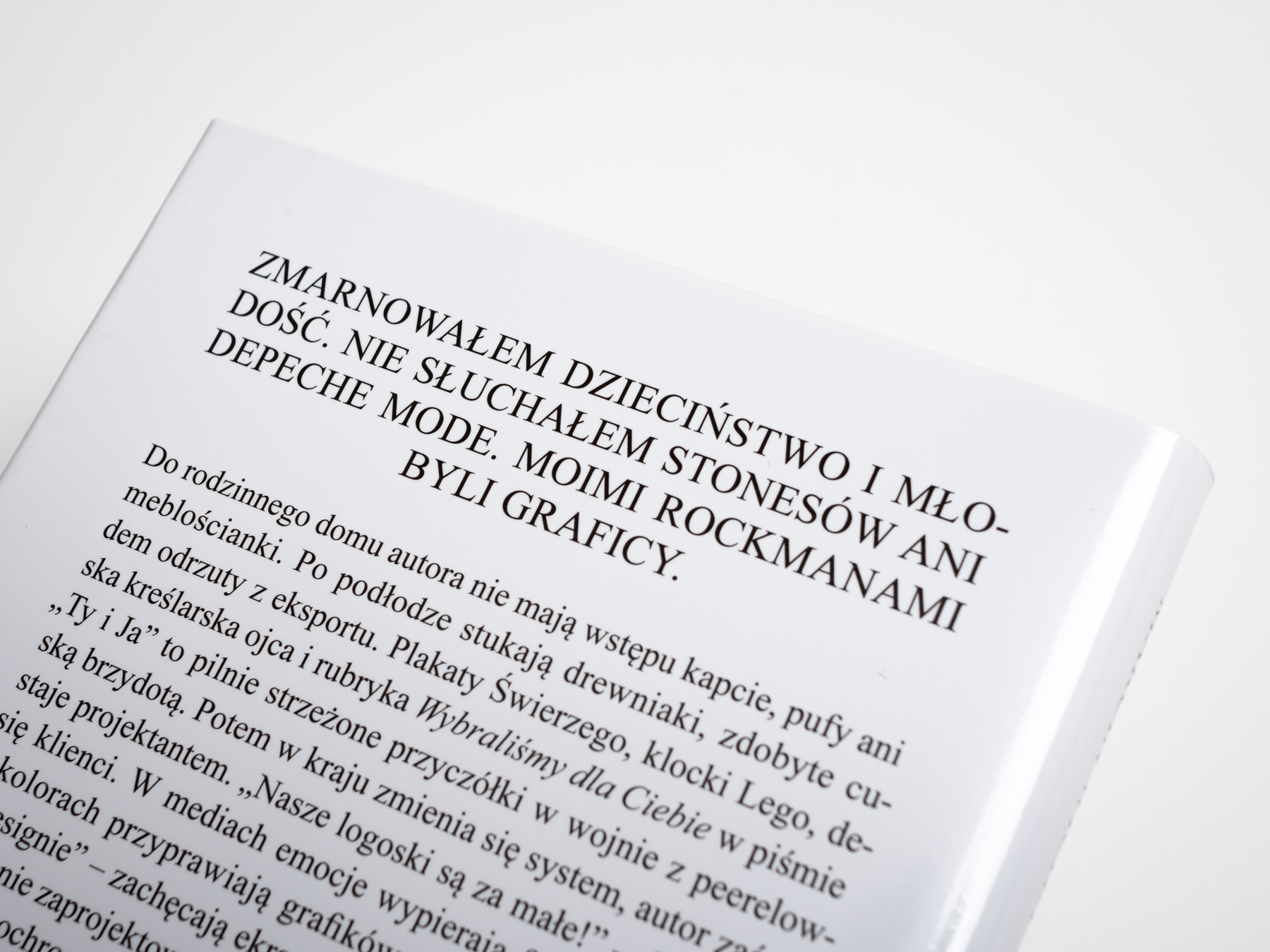
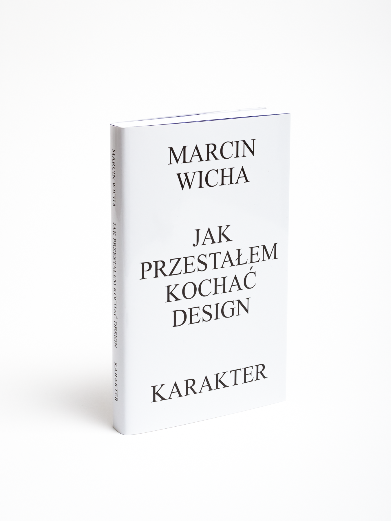
Two memories-inspired books by Polish designer-turned-writer, Marcin Wicha. The second one, Things I Have Not Thrown Out, won the most important book prize in Poland, Nike, in 2018. I am lucky to have such a writer in my publishing house, and I am more than happy to design his books. It was a bit of stress, given that Wicha is a designer himself, so no tricks for the lay-people this time. Luckily, stars aligned both times favorably, and I come up with a satisfying idea. How I Stopped Loving Design (an account of growing up in late-Communist-era Poland and the early capitalism years of the 1990s) has the only book cover I designed in Microsoft Word (but to be honest, I refined it later in InDesign). It features the name of the author, the book’s title, and publishing house name all written in Times New Roman, centered on a white page. Comic Sans would be too much in-your-face, while Times looks even a bit dignified here, though there are still people there who believe that this cover is a mistake somehow.
Year: 2015 (How I Stopped...), 2017 (Things...)
Page size: 125×205 mm (4.9×8.1 in.)
Pages: 264 (HISL), 200 (TINTO)
Paper: Munken Print White 15 90 g
Binding: paperback with flaps and dust jacket (HISL), hardcover (TINTO)
Cover material: Geltex 115 g uncoated stock (TINTO)
Typefaces: Times New Roman, Paperback 12 (HISL), Harriet, Baskerville Ten (TINTO)
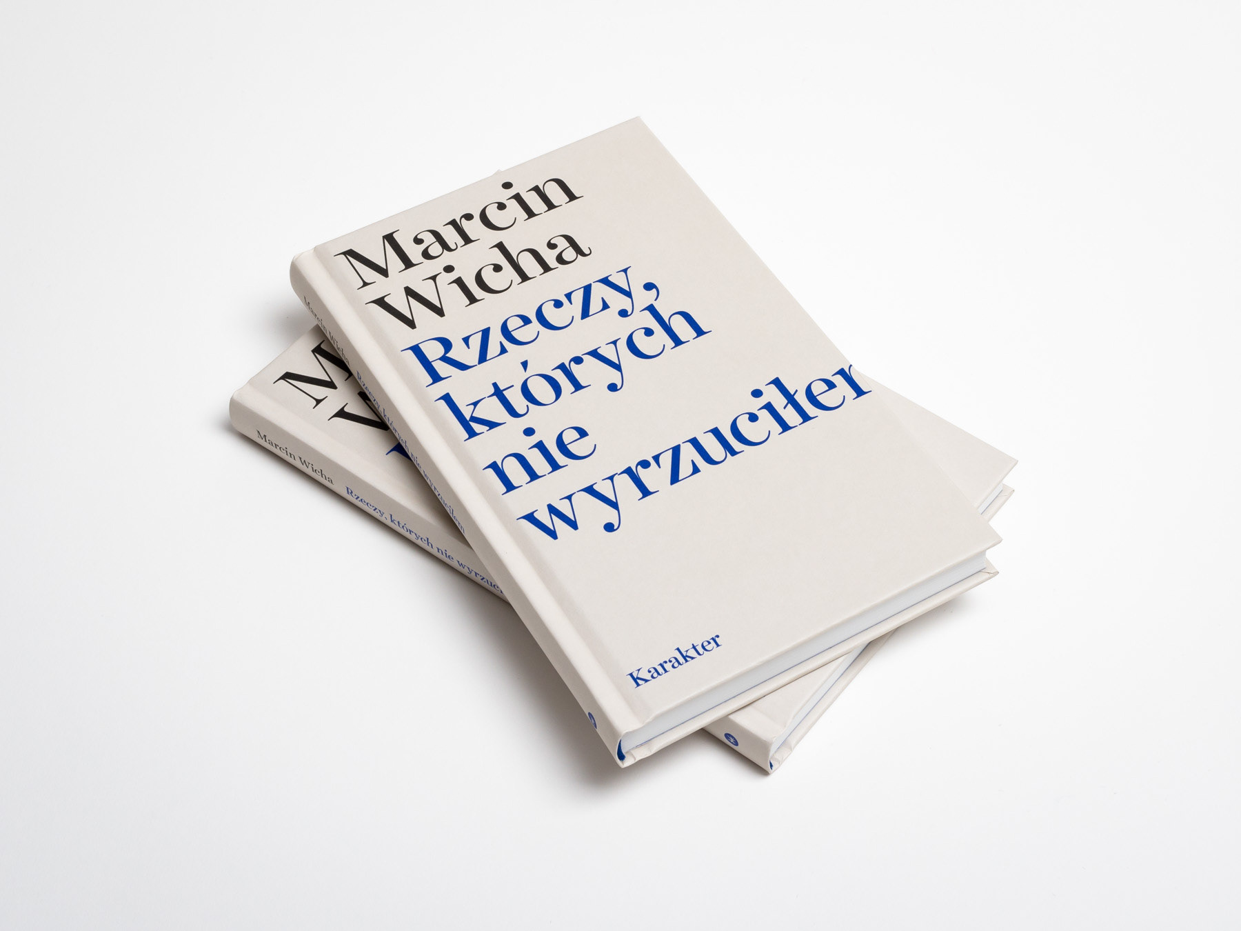
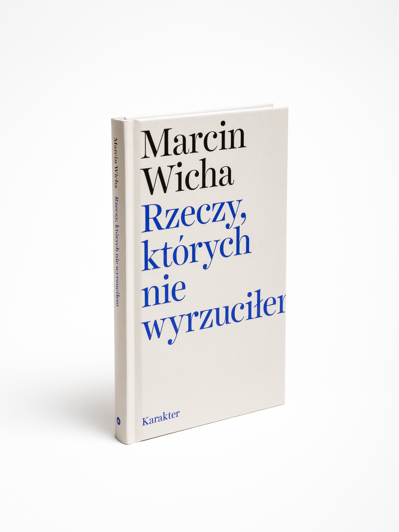
There are even more people convinced about my mistake when it comes to the second book, Things I Have Not Thrown Out – the missing part of the final 'm' of the title is especially unnerving. But as it is a book on loss (of the author’s mother, see, ’m’ again), I think it is quite appropriate, though designed almost by accident. When I chose a default font and size and written the title in InDesign, the layout was quite similar – the 'm' cut in half caught my attention immediately.