Coetzee, Atwood and my favourite: Flannery O'Connor! I have received both praise and criticism for these projects. To be honest, I'm not sure what it proves. Maybe just that people have opinions. There have been a lot of comments about something being illegible on the front cover, but seriously, just turn the book over so that the silver foil reflects the light and the text is easy to read. Well, it's not much of a challenge. Clarity fetishists like to extrapolate from one (ONE) case: pharmaceutical leaflets, and suggest that good design is all about readability. Well, no, not always. The inside of a book should be readable, because you buy a book to read it, but the cover is a different animal.
I also get the impression that a lot of people are disappointed that these covers don't mean anything. That there's no joke. But I feel more and more that not every opportunity and not every text has to be fully exploited, that a project doesn't always have to sell itself with cleverness.
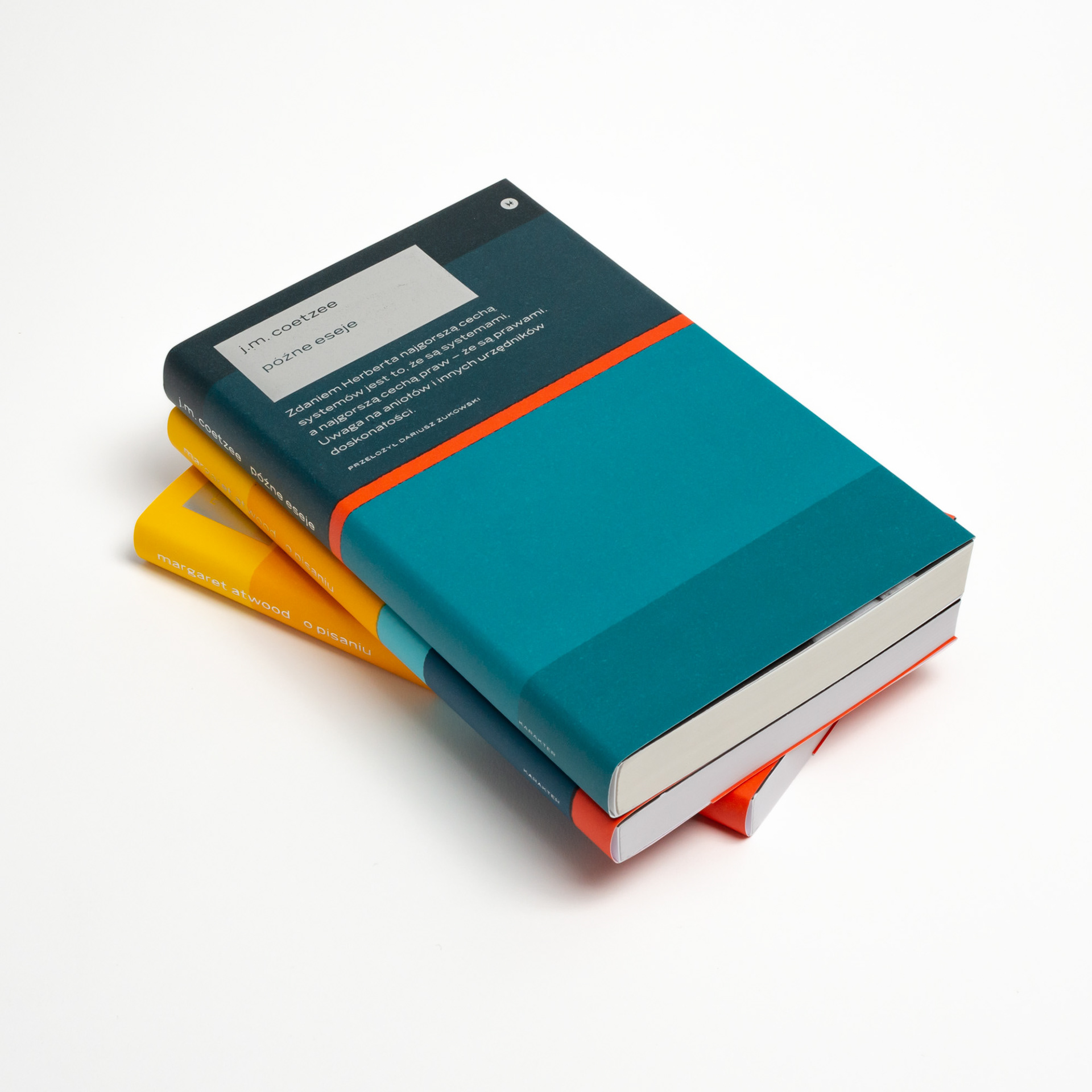
Year: 2020–2022
Page size: 116×195 mm (4.6×7.7 in.)
Pages: 160–320
Paper: Stella HB 2.0 70 g
Binding: paperback with dust jacket
Cover material: Amber Graphic 300 g, Arctic Volume White 170 g (dust jacket)
Cover material: Amber Graphic 300 g, Arctic Volume White 170 g (dust jacket)
Typeface: Benton Sans Wide, Guyot (body)